
(Image by Ashim D’Silva, via Unsplash)
So I might as well admit it. I have a spine fetish.
Book spines do SO MUCH WORK, and are so under-regarded. Everybody worries about the splashy book cover, and in the age of online book sales, cover art is indeed a big deal. But in the world of visual, material books—in bookstores, in libraries, even at home once you’ve bought them—that tiny little ribbon is doing almost all the work there is to be done.
And it is tiny. Even a giant, Song of Ice and Fire-sized brick has a spine that’s maybe nine inches by two in full hardcover expanse, a fifth of a sheet of notebook paper. Most of us get way less space even than that; most of the books that I’ve laid out for print are more like 8.5 inches by two-thirds, not even six square inches. By comparison, a standard business card is exactly seven square inches, so we can think of a book’s spine as a linear-format business card, offering both information and allure simultaneously. It’s an ingenious graphic design problem, and one that I wish we talked more about.
I’m not trained in graphic design, as you can probably tell. But I’ve hung around books for over sixty years, and I’ve learned to copy some things. Here’s the five spines of my five most recent books.
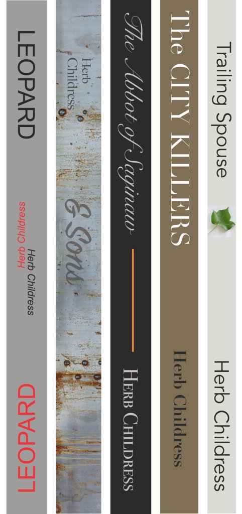
What’s going on here? Well, two things (at least). One is that the graphic language of the cover is carried onto the spine in some way, usually in color and typeface both and with some variant of the layout logic. So for my book Leopard, all of the cover text is doubled, in black and in red, rotated 180 degrees across an implied horizontal centerline, to suggest the idea of a table tennis table with two opponents across a net, and also to pick up on the fact that table tennis rackets have to be built with red rubber on one face and black rubber on the other so that your opponent can see what you’re hitting with. (Don’t even start… read the book if you want to know more than that.) The spine amends that idea while still adhering to it. The galvanized farm rust of & Sons is carried over; the single leaf of Trailing Spouse is carried over; even the gold accent line of the cover of The Abbot of Saginaw is carried over. If the cover is the first twelve lines of the sonnet, the spine is the last two, holding the same theme but in a new rhyming pattern.
The other thing that’s happening, and you can check this against the books on your own shelves, is that the title of the book is emphasized and the name of the author downplayed. Have a look at this image, from a “book spine poetry” contest entry that reads The Female Brain / Educated / GirlBoss / Yes Please:
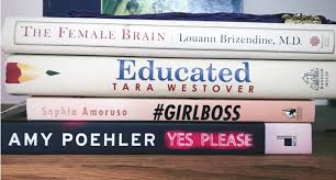
There are four books here, and in three cases, you’re being asked to primarily consider the title; the author is more or less anonymous, not a brand name. In the fourth case, you’re being asked to consider the author, because Amy Poehler is famous and funny and we’ll read anything she writes. Go to the bookstore and look for whatever array of “big name authors” you can think of—Stephen King, Donna Leon, Louise Penny, John Grisham—and you’ll find that they’re quite literally “big names,” the authors whose name is bigger on the spine than the book titles. This is what agents and publishers talk about when they use the word platform: is your name big enough for the book to stand on and be visible in a crowd? Will people fundamentally buy you, and only secondarily care about the specifics of what you carry?
Look again at these four commercially-released spines. Visually, they aren’t doing anything especially flashy. They can’t, really: you risk illegibility when you’re too busy in a small space. They’re giving you information, about an interesting idea or an interesting person; they’re carrying over the colors and typefaces of the cover; and they’re hinting at a graphic feature (the frame around the text on the top book, the sharpened pencil point on the second, the hashtag/italics on the third and the illusion of a neon sign on the fourth). That’s it. That’s the vertical business card that people will use after their experience of the cover has faded.
These spines are also doing one other thing, which is vetting that the book has been sponsored by a legitimate publishing house. From the top down, we have the marks of Morgan Road Books, Random House, Penguin, and Harper Collins’ Dey Street. My professional books have those marks as well, but my novels do not, nor do they have ISBNs and barcodes on the back. That absence also does a little work, indicating that those stories inhabit the world of gift rather than the world of commerce.
I’ve looked at the edges of books for my whole life, mostly without thinking about it until twenty years ago when my own ideas started to be wrapped in covers. Book spines are compressed composition, remarkably ingenious when they’re done well, and deserve to be celebrated as an art form of their very own merit.


